
Moodboards. I mean it’s probably a board, possibly about moods and potentially online. Maybe.
I’ve had dozens of discussions with other creative’s who say ‘Moodboard’ with abandon and enthusiasm. And they all seem to know what it means. I’m a copywriter, so when in doubt I go to the dictionary, the thesaurus or good old Google. Sure, I found moodboard definitions, synonyms and examples. But was I any more enlightened? No. And if I had a moodboard it would register my mood as confused (or do I need a mood ring?).
Thankfully, I’m part of The Sundae Agency and have access to brilliant creative professionals who are happy to explain things to colleagues and clients. It was my pleasure to sit down with Sundae’s chief creative, Casey and chat about how to master moodboards and improve the creative process.
The way Casey explains it, moodboards are simultaneously creative and strategic; which are two values you don’t always find together. Creativity is an expansive process, strategy is a refining process. ‘A moodboard’, says Casey, ‘gives you both.’ ‘OK’, I nodded, ‘I’m sold. What else?’
Fast forward five minutes and I’ve learned something else useful. One of the primary benefits of doing a moodboard, at the start of a design project, is that it’s a great way to visually show our clients the direction a brand can go. It helps our clients discover what they like and don’t like. Because (and this will come as a surprise to no creative ever), clients don’t always know what they like until they see it. So, a moodboard is a tool for moving the client’s idea of their brand from a state of chaos (boo!), to one of order (hooray!). It refines, it focuses, it inspires.
Let’s turn to Casey and her 5 Steps to Mastering Moodboarding, because the general benefits of moodboarding are useful and this guide is invaluable.
STEP 1 – Read (& Write…a little)
I think Casey might have been easing me in because the first step involves every copywriter’s first love – reading. So get comfy, grab your Brand Identity document (or as we like to call it, the Brand Playbook), and look for your keywords and taglines. Once you’ve got these, reading time is over (sigh) and it’s time to brainstorm ideas around them. This process is strongly informed by the tone of voice of your brand, so keep it in mind. You’re also going to want to brainstorm ideas around the brand values and identify what the brand cares about. Casey used The Sundae Agency to illustrate her point. You’ll notice we weren’t shy with our keywords and you shouldn’t be either. If a keyword resonates with the brand, include it.
Real Life Example
Brand: The Sundae Agency
Tagline: We do branding for stuff you eat and drink.
Keywords:
Inspired. Focussed. Full of creative energy. Friendly and approachable. Personality. Real. Creativity. Focussed. Overachiever. Energetic. Credible. Enthusiastic. Witty. Intelligent. Finger on the pulse. Collaborative. Clever. Inclusive. Team. Approachable. Chatty. Confident. Fresh. Supportive. Punchy.
STEP 2 – Research
Don’t be put off by the word ‘research’. There are no lab coats or Google Scholar searches involved (unless that’s your thing). Get online, get on social media and research brands you think reflect the attitudes you identified in Step 1. They don’t need to be in the same industry because you’re not looking for competition, you’re looking for inspiration. Cast a wide net. The goal is to see how different brands filter the attitudes you’ve identified through to their visual identity. If you don’t know where to start, Casey has some user-friendly research sites she recommends.
Check out the following:
ABDUZEEDO
BP&O
Mindsparkle Mag
AWWWARDS
Design Week
Creative Review
Brand New
ID
Real Life Example:
The Sundae Agency research included Wahaca, the rebrand by Without Studio. We were drawn to Wahaca because of their bold use of colour across a food brand and we love how they go about injecting personality.
We also really liked this agency – Saint Urbain – because of how they positioned themselves as food & drink without alienating other industries. This was super important for our rebrand as we have lots of clients that aren’t in food & drink.
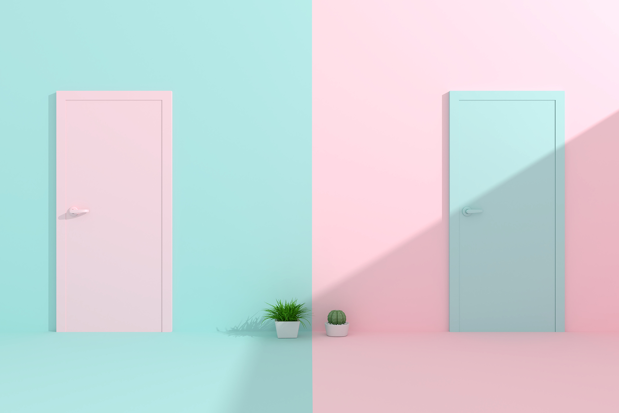
STEP 3 – Routes
Based on Steps 1 and 2, Casey then decides on two distinct routes to moodboard. Now this genuinely confused me. Why go to the trouble of doing two when you’re only going to use one? It would be like a copywriter producing two sentences, covering the same content, but in two different styles. Isn’t this just making the process longer? Yes and no. Doing two routes instead of one does add a little bit of time, in the short-run. But in the long-run it is a massive time saver. It’s a way of weeding out anything the client is totally opposed to. As Casey says, ‘It’s endlessly fascinating how subjective people’s tastes are.’ And because people don’t know what they dislike before they see it, by providing two routes early on, it ensures the preferred route is chosen by the client. To illustrate this point, check out how The Sundae Agency did this exact process.
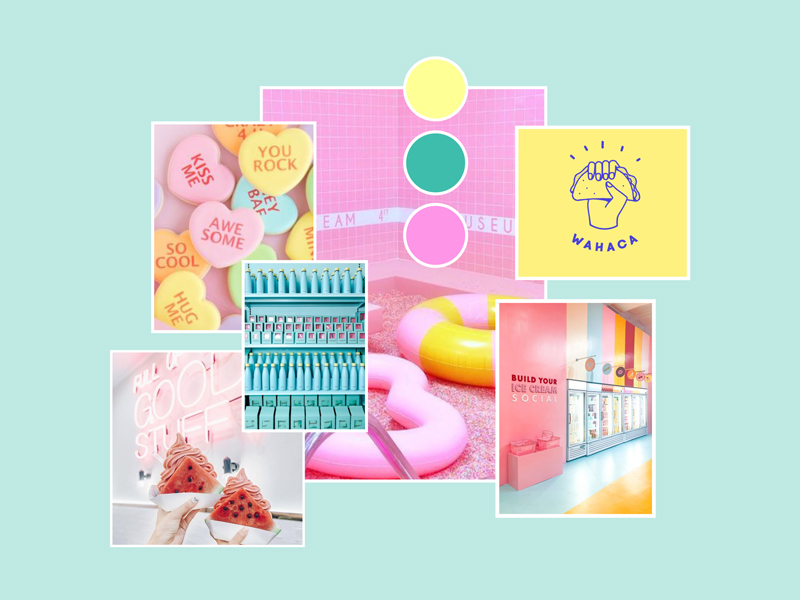
Real Life Examples
The Sundae Agency
Route 1: Ice-Cream Sundae
Colours that are at home in a gelato window.
Fonts that look edible.
An agency that looks like it always orders dessert at the end of the meal (because we do).
Route 2: We Are Serious-Fun
Minimalist branding to not overshadow the clients we work with.
Modern fun typography, but muted colour palette.
Asserts authority in an accessible way.
Clearly we went down the first route.
STEP 4 – Retrieve
Now we have keywords, taglines, values and two routes. Search the research sites given in Step 2 and also Pinterest, Behance, etc., and start retrieving images. Don’t worry about colours or if they really suit the routes just yet, you’re going to figure this out when you put the moodboards together. This step is all about starting to paint a clear picture of how you want the brand to look in the 2 routes. Consider typography, photography style, colour palettes, textures etc.
STEP 5 – Reflect
It’s the final step and it begins by creating a blank document (GoogleSlides, Keynote and PowerPoint are all great options so pick whichever you prefer). Then put all the images on a page that you think reflect the keywords and the route. Reflect on what you’ve done in the previous steps. Seriously, take a little time and reflect. Get it clear in your head. The crucial part of this step is ensuring each page is cohesive. If it isn’t, then this whole exercise is a waste of time because you’re not going to have a moodboard, just a bunch of unrelated images. So keep reflecting back to your concept and brand keywords. Then edit with zeal and abandon if coherence isn’t being maintained.
Real Life Example:
And that’s it! Follow these 5 steps and the value you’ll get from moodboarding will drastically increase (I speak from experience). Alas, I remain a copywriter, so despite my newfound respect for moodboards and moodboarding, I’m destined to live my life with serious reservations about the noun ‘moodboard’ becoming the verb ‘moodboarding’. Is this pedantry on my part? Stubbornness? Adherence to rules of grammar? Who knows. However, I now know what a moodboard is, why it’s useful, and the value moodboards bring to branding and the creative process. And now, you do too. Happy boarding.